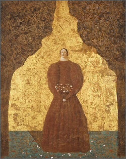
 Toshio Arimoto was a Japanese painter
who was born in 1946 and died at the age of 38 in 1985. His picture period
as a painter was relatively short, about 10 years, but he produced
pictures of style that was completed from the beginning. Please look at
the image. His style is clearly shown in this image. A person with a small
face with a round face stands alone. The body of the person is larger than
the head. The body, especially with large shoulders and arms, is
squatting. And, in many cases, the smaller the face lacking balance, the
more expressive it does not have emotions of emotions and pleasures.
Frequently, it is a calm and dreamy look. The painter depicted the person
as a half-figure, omitting it, or drawing a symbolically simplified
background on the back. Moreover, its color is a unique dullness.
Therefore, the characteristics of Arimoto's pictures are such a patterned
screen composition and color. Toshio Arimoto was a Japanese painter
who was born in 1946 and died at the age of 38 in 1985. His picture period
as a painter was relatively short, about 10 years, but he produced
pictures of style that was completed from the beginning. Please look at
the image. His style is clearly shown in this image. A person with a small
face with a round face stands alone. The body of the person is larger than
the head. The body, especially with large shoulders and arms, is
squatting. And, in many cases, the smaller the face lacking balance, the
more expressive it does not have emotions of emotions and pleasures.
Frequently, it is a calm and dreamy look. The painter depicted the person
as a half-figure, omitting it, or drawing a symbolically simplified
background on the back. Moreover, its color is a unique dullness.
Therefore, the characteristics of Arimoto's pictures are such a patterned
screen composition and color.The impression that
we saw his picture is not to strongly assert emotions and philosophies,
but to keep comforting what we see modestly is simple. The painter himself
likes baroque music and he himself tells himself to take an instrument or
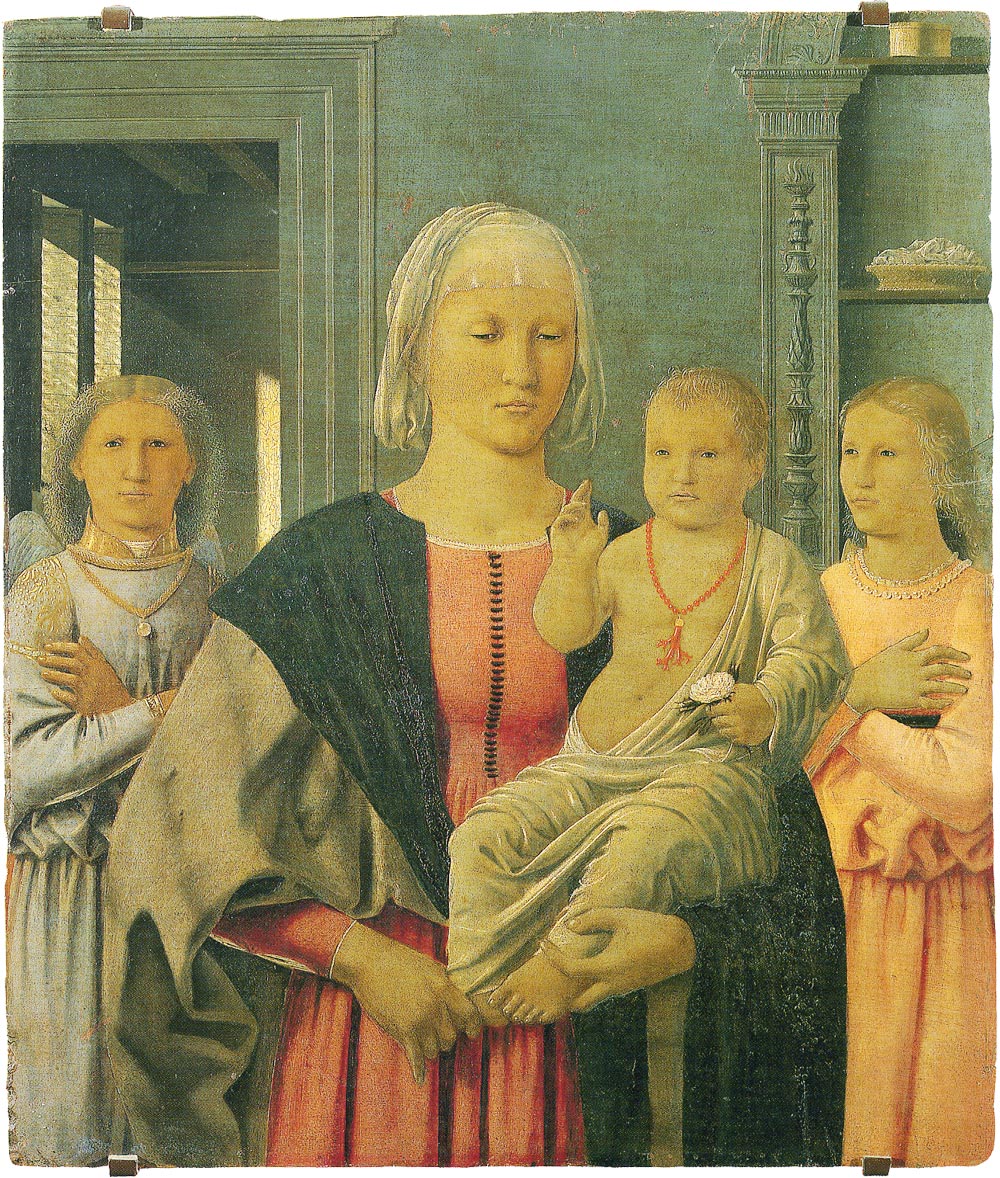
to tell himself to the early painters of the Renaissance from medieval
like Piero de la Francesca. So we can imagine a figure like religion and
picture like a medieval monaster in Europe. Arimoto's paintings are different from the fact that modern European paintings pursued the idea of truth and beauty and was realistic. There are few evidence that you learned objective realism, even if you saw pictures of the original warrior era. It is different from what recognizes existing things at the moment and sets them on the canvas. His picture is an image that was created under the influence of internalization, experiencing other image images he saw as texts. He likes back music and plays himself. Music is made by combining various sounds. This combination does not copy what already exists in the environment, but diverts, transforms, or combines the information of the music pattern made by the predecessor. How to create his picture is close to how to combine this music. As a result, a person's image of a unique style commonly appears in his picture. That, like music, especially the light motif of the opera, appears in his pictures and composes the picture. In contemporary Japanese art, there are not a few painters who shaped unique characters, just like Arimoto. For example, Yoshitomo Nara. Characters produced by Nara are different from Arimoto, but they are common in terms of creating a screen centered on characters ■People's Pictures, Actually Character
Peace Arimoto drew only portraits. I can not find any landscape paintings or still life paintings on his picture list. Moreover, in most cases, the person in his portrait is drawn either whole body or upper body with a simple pose with little movement alone. The figure depicted by that person is a unique thing pretty deformed. For example, the head is extremely small. How to draw a face is uniform, it is impossible to distinguish person's personality. Since expressions are not drawn on the face, I can not imagine what the person is thinking or thinking. Hands are extremely small in palm. Therefore, expression of hands which is an important element of body language is small. The upper arms against the head and hand are as unbalanced as possible. For that reason, the costumes of people are plump and medieval plump style with sleeves. The pose of such a person is stationary and stylized. I think this is a kind of character piece. For example, it is like Sanrio's kitty. Although the character Kitty is unchanged, it is worn in various costumes and placed in various scenes. This is a variation as a whole. As a result, various Kitty are printed on stationery and accessory accessories and become products. Characters of Arimoto's pictures play a role similar to Kitty. In other words, among a lot of pictures, Arimoto constitutes a picture by keeping the character immutable and applying it to different backgrounds. The big reason for this is the constraints imposed by Arimoto's drawing method. He visited an old church around Europe in his school days. So he was fascinated by the old fresco painting from the Middle Ages to the early Renaissance painted on the walls of the church. Unlike oil paintings that we see routinely in art museums and galleries, frescoes are a technique to paint plaster over the walls of churches and other buildings, and to fix and pigment the plaster before the plaster dries. Therefore, oil paintings and frescoes differ in their basic character. First of all, frescoes are paintings that you have to paint before the plaster dries and you can not paint it carefully like oil paintings or you can not redo it. Therefore, it can not draw precisely like an oil painting. It will make a difference in painting method. Oil paintings draw as if paintings are placed on the canvas, and furthermore, it is possible to overlay paint on top of the paint they put. As a result, oil paintings can express subtle color and shade gradations. On the other hand, frescoes can not be overlapped in color because they are fixed by permeating the pigment into the plaster. Instead, it produced a unique effect similar to the bleeding that the pigment penetrates. And color is different between oil painting and fresco. Arimoto was fascinated by the characteristics of such frescoes. Therefore, he mastered the techniques of fresco by himself. Besides, he painted the fresco on a canvas for oil painting, not on walls painted with plaster. In addition, he repeatedly devised attempts to use the paintings of Japanese paintings as pigments. Therefore, he gave up fine picture and coloring. In other words, it can not express three-dimensional shadows and textures of graphic paintings. Among the restrictions of such a drawing, there was a screen that arranged a unique character as what he could draw. Moreover, his planar and pattern character was also a material that makes use of the characteristics of fresco. Rock paint is easy to unevenly paint, and from the other hand, unevenness produces an effect that creates a taste by overlapping with subtle changes and blurs. It does not match the texture of oil paint, but it becomes an illustration if it is like an acrylic paint. When painting a pigment and drawing a design with fresco's method, it will be completed as a picture that makes it feel old-fashioned and tasteful.
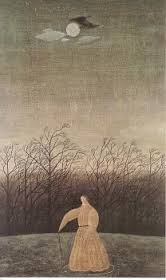
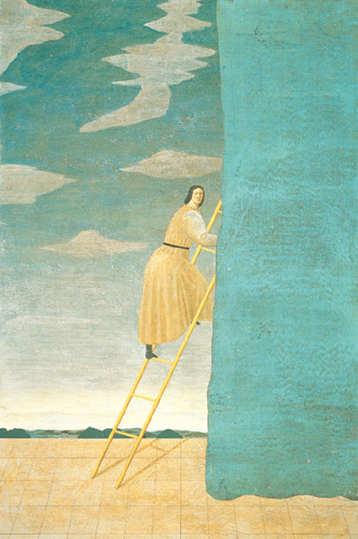
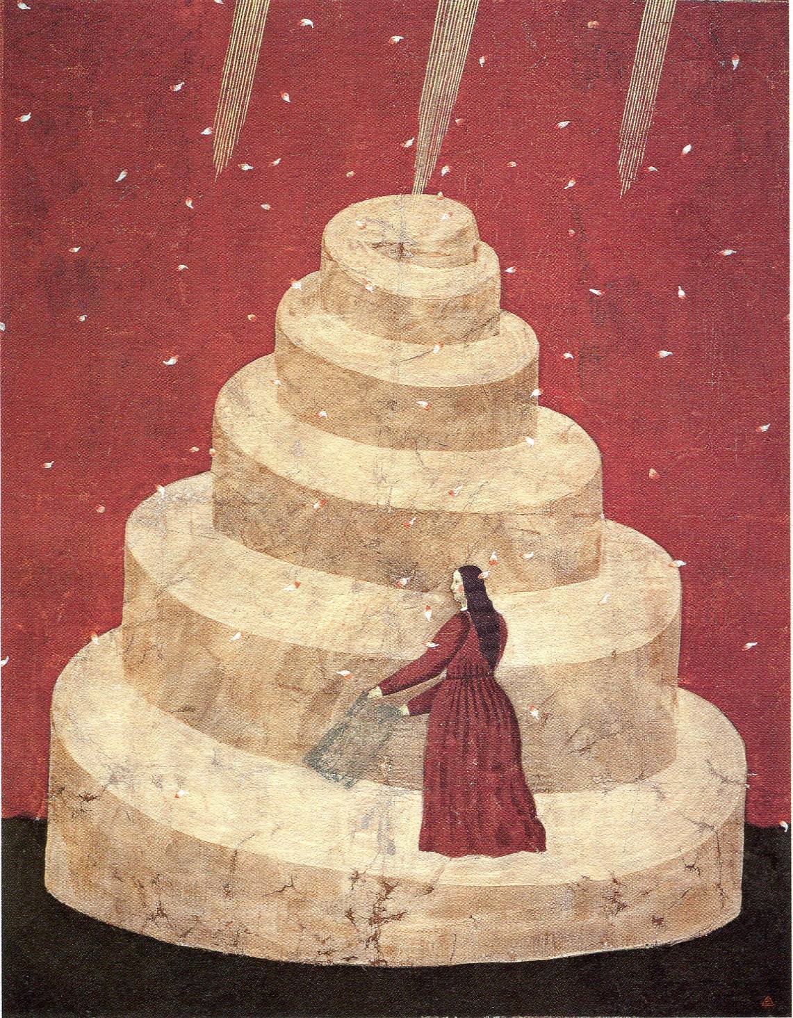
Let's focus on the background further. I touched a little bit ago, but this background is far away from the realism, just like a stage device like an illusion. We feel that the style and symbolism of the background of this picture is unnatural if we look at this as a patterned sky and cloud shape and mountains that are so disproportionately low as the background as the stage. There is nothing. Also, as a stage device for a ladder with a person's legs on it, if we look at it, we do not need to symbolically search for a special meaning there. Originally the illusion is the internal aspect of an individual, for example, it can be said that the dream has become enlarged, in which there is a philosophical or constructive element through which words intervene. However, we do not feel much about the elements that were built by words in his picture. For example, we never find a symbolic symbol in his picture, the use of an iconic icon. We do not feel that there is another deep layer beneath the surface layer of the screen that he draws, but it seems that only the surface layer exists. It is because we see the image of silence in pictures by Yuzo Yui only on his picture surface, that is, as if you scooped the supernatant. As a reason for that, I think that it depicts the writing of the stage. His picture is a place for an actor to play a character, rather than reflecting the painter's inner heart. So, the composition of his picture has removed extra elements, leaving only the parts necessary for the character to perform on the stage. As a result, his picture was not a real landscape but a deformed design.
This piece is the
stage of theater. However, the theater here is not a collision of
individuals of modern theater, but rather a stylistic style like the
medieval styleful and superficial Co-media de ralte, as well as the
medieval noh play of Japan It is highly symbolic. The place where we
did not directly convey the drama of human relations without the silence
or style like scoured out the surface layer of Nohgaku, or the expression
of the inner mediator of the individual, and the things we think about
this picture There are common points. That is also the symbolic nature of
the simplified design of the background, and the character whose
expression is not felt more than anything resembles Noh face. In addition,
the fact that movement of the fingertip is hidden behind the costume's
sleeve in Noh music is similar to ambiguity of the meaning of movement of
his character. So, when we see this picture, I do not look for meaning as
to what is drawn in the picture. Therefore, Toshio Arimoto 's picture world does not directly represent the real world, but rather does not represent the world of fantasy but instead transfers it to an indirect place called the stage of reality or fantasy , Indirectly, that is, it is a world where the veil called stageization is applied. In his picture, the whole world was planar like a writing split and the symbolism as a result of erasing what is unnecessary for the stage remained. However, his picture is not the world as a whole but a stage that cut out a part of the world. He will not do anything more. The rest was left to the imagination of the person seeing the picture. The result appeared as an impression of tranquility. ■In Most Works, Only One Person Is Drawn
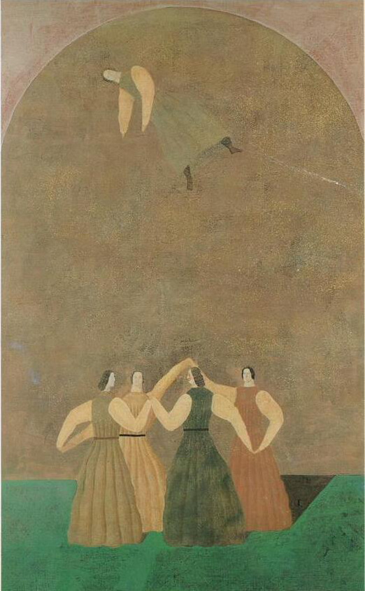
This picture is a composition that one person is floating in the upper part where four people are holding hands and joining hands. He says, as I draw more than one person, I will bring in a relationship, so I decide to make it as a person. In other words, he thought that he did not want to bring in the relationship between people and people. However, he has made several people appear in this picture. So, did he make a relationship appearing on the screen saying that he wanted to avoid bringing in with this picture? I do not think so. Let's examine this in the picture. Of the five people in the picture, the four other people holding hands, other than one who is floating, seems to be one object by four people. I saw four people like parts of the object. I can not see the individual personality of the four persons drawn separately, so it can not be seen that the roles of the four people are distributed. The difference between the four people I can distinguish is that the colors of the clothes you are wearing are different. So, even if I change the order of the four people, I can not find a big difference there. He said that if there were two or more humans, a relationship would be created there. But I think that there are two human beings, so that if they are just side by side, no relationship will be born. I think the relationship between two people is born, so I think that two people must be different. However, the four people in this picture looked the same. Let's change the viewpoint and see the picture from the viewpoint of the space composition of the drawn screen. In this picture he has five people drawn in a space like a dome. At this time, how to arrange and configure five people in a dome-like space. That is the space composition of the screen of this picture. The space composition is also the relationship of the position, size, pose, color, etc. of five persons. I think that this relationship does not mean that he does not want to bring it into his picture. In many of his pictures, he has only one person drawn as a fool. However, he also depicts something other than a person, such as instruments, furniture, others at the same time. Considering the space structure, both people and objects occupy the same space, so in that respect it is necessary to calculate the positional relationships and relationships in the same way as people on the same screen It is gone. Therefore, he does not dislike the relation of space composition. In the explanation so far, we divided relationships into two types. In other words, a relationship is one relationship between a person and a person, the other is a relationship between a person and an object. This is a rough classification, he does not dislike relationships between a person and an object. The characteristic of the relationship between a person and an object is, in short, one-sided. For example, a musical instrument which is a thing is an instrument by using it as a musical instrument for people to take music and play music. Things called musical instruments exist by themselves, but people make something meaning, for the first time a relationship with a person is born. However, there is no reverse. The reason is that people are conscious of it. Applying this to his picture and thinking about it shows that treating a person and an object as a relationship in terms of space composition does not regard him as a relationship. Therefore, I think he does not hate the unilateral relationship between a person and an object. On the other hand, the relationship between a person and a person is interactive as they are conscious of each other. In other words, in relation to an object, people simply meaning things unilaterally, but in relationships between a person and a person they also add directions that are meaningful to each other. The relationship between a person and a person is a meaning and meaning to each other. So, there are conflicts and empathy, if there is sympathy there, various forms are born. It is exactly such relationship that people recognize themselves and establish themselves in relation to others, such as identity as ego identity. Perhaps it is not a relationship between this person and a person that he hated.
However, these paintings depicting the relationship between people and people have different movements of each person, given different roles in the screen, some of which the relationships we see are seen in drama In order to make you feel, the painter must draw out to explain who each person is facing, what kind of expressions are floating, what kind of things they are doing. Therefore, the painting will pursue detailed and realistic portrayal. On the other hand, those who see the paintings will understand the picture as they are drawn to follow the explanation. In other words, the viewer can not enjoy the drama of the picture if he deviates from the drawn content and turns his imagination free. I think that Arimoto tried to avoid this. What Arimoto called
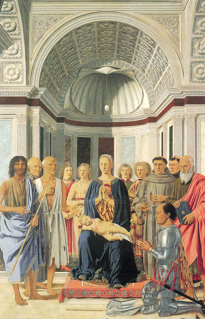
for is that Piero de la Francesca is a feature of medieval paintings that
we tried to escape, I think. In the Middle Ages, it was good just to think
about the relationship to God, as the cosmos were formed by God, which is
an absolute being formed. I think that this is a considerably simplified
decision. I think that there is no personality or unique presence in a
person in a medieval painting. There are several reasons. First, in the
Middle Ages, people emphasized the relationship between God and people
rather than the relationship between people and people, or between people
and things. If cosmos were made by God, people were also created by God,
meaning this cosmos. In other words, the relationship between people and
things can be replaced by God and man. Even if there are multiple people,
the relationship between each person and God takes precedence over the
relationship between that person and the person. In front of God a man
becomes like a thing in front of a man. The relationship between God and
man does not create conflict or conflict like human-human relationship
Therefore, a quiet world appears instead of a drama. So, the figures of
medieval paintings are uniformly facing this side of the screen, and they
do not do what they do with each other in the screen like the subsequent
paintings. One reason is that the relationship between the people on the
screen is made secondary, because it is an indication that people are
headed to God who is on the other side from the screen as seen from the
screen. Three of the five people of "Rondo" face the front, the other two
are facing sideways seems to avoid creating a relationship between people
by matching each other It seems to me that as a result it seems to escape
from the vividness of human drama resembling the religious serenity of the
medieval paintings as explained above. ■Not Alone Is Solitary
The third reason is that the whole screen of Arimoto’s picture is set like a stage. Before, I explained that he painted the background like a stage split. In other words, his whole picture is considered as one stage. Even if the actor plays alone on the stage, a lot of audiences are watching his performance. Therefore, the actor himself is not lonely. If the original pictures are like the stage, there should be audience seats surrounding the stage in fact. However, he has not painted a spectator seat. In other words, he cut out and painted only part of the stage. So, I think that this picture has a whistle by one person on the screen, but at the same time Arimoto has created with the consciousness that the audience is around the screen. ■A Picture World As A Stage
However, if I look at this as the background or
stage setting of the stage, I can be convinced to this for seeing as a
mountain. I look at many such backgrounds that were simplified decisively
or were abstracted in a stage setting. Only the background of the stage
does not know somehow that it takes out independently. However, as for it,
when a spectator sees an actor act before that, a spectator turns out that
it is the background of the stage. And a spectator reads the meaning more
than an actual mountain on the mountain of a background by simplifying the
background of the stage and being symbolized. From the flow of a play, the
contents of words, or an actor's performance, a spectator interprets
another symbol there. I think that it may happen that it is the same as
that of the time of seeing the stage of theater when I look at this
picture. I cannot regard the object of the background in this picture as
an actual mountain. The mountain in this picture is carrying out form well
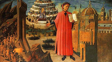
similar in the figure of the Tower of Babel in the Old Testament, and the
figure of purgatorium in the "Divine Comedy" by Dante. The person in this
picture has stepped toward the leg toward that object. I cannot recognize
that this person is climbing the mountain or whether it is only looking
up. It is because there being no motion and expression are not expressed
to this person, so I can imagine what this person
considers.
Here, let's arrange a few given the opportunity
of a review. Toshio Arimoto found out one ideal thing in medieval pictures
including Piero Dela Francesca. He began to draw a picture on these
pictures in pursuit of the homogeneous thing. However, the pictures which
he actually drew completely differed from the pictures for which he asked
as an ideal. Both have the similarity of a technique externally. For
example, superficial, fanciness, and technique of fresco painting. I will
often compare both here. Piero Dela Francesca had a posture it is supposed
that is likely to be escaped and come out from medieval times towards the
modernistic Renaissance, though based on pictures medieval times. He tried
to draw the reality on which the person was lively, and the drama of the
relation between people and a person been and made. On the other hand,
Toshio Arimoto tried to eliminate from pictures the element which Piero
Dela Francesca tried to draw rather. Therefore, the revolution to the
medieval times for Toshio Arimoto was not simple. For him, the modernistic
world after the Renaissance was the group formed of the individual with
the independent character, and was a gathering of the elite. According to
Arimoto, it was the elite whom Piero Dela Francesca tried to draw.
However, people of a large number which are not the elite exist in an
actual world. It is the public. The popular culture towards this public
was produced in the present age. In music, the deep and dramatic musical
piece which made two or more themes like classical music constitute
intricately was kept at arm's length. The music liked by the public was
the music similar to the structure of medieval times or baroque music
which is simple and repeats one phrase. Some pictures at which Toshio
Arimoto aims were related to this. It was such a thing the medieval times
for Arimoto. He placed the abstract background on a style target like the
stage of theater in "Day of Falling Petals". Furthermore, he made
characters one person and eliminated the portion of the drama which human
relations are and it makes. As a result, he has eliminated a base like God
in medieval times, and the thing which takes the lead like the drama of
theater. "Day of Falling Petals" became the pictures lacking in a center.
And the opinion what was drawn was
lost. ■Stylized Character Characte
Arimoto himself says he does not want to draw a
woman. He can be a woman or a man, just drawing a character character. The
woman he is drawn is a result of his styling character. I will think about
the circumstances from now on. He did not want to draw his legs. If he draws a person's legs, the one who sees the painting knows what he is doing - walking, sitting with his legs sitting - clearly. The picture as a whole becomes explanatory. He wanted to paint the picture implicitly, without making it descriptive. Therefore, he did not want to draw his legs. So he thought of hiding his legs. If the legs hide, he will not have to draw the legs. To hide your legs, you can cover your legs with something. He came up with a skirt as if he covered his legs completely. And he decided to draw a woman as the best person to wear a skirt. In other words, he began to draw a woman as creating a form of hiding the leg. For example, walking legs, legs sitting in pairs are all covered with skirts. He acquired the freedom to draw the lower half as a single gathered form. He says he is not conscious of drawing a woman.
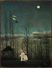
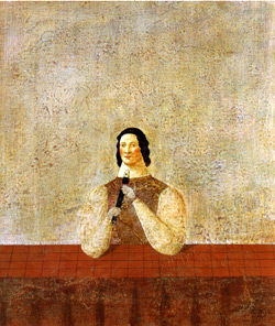
Let's see " Lonely Night."Under the full moon, a person wearing plenty of medieval-style costumes is standing with a stick on the right hand. Some point out the similarity with Henri Rousseau's "A Carnivals Evening." Arimoto highly appreciated Rousseau's idea of drawing out simplified and reproduced human vision of removing the disturbing thing and seeing the essence of the tree if it is a tree. Arimoto paintings are similar to those of Rousseau, but they are different. For example, when painting trees, the two painters simply describe the shape. Rousseau is reproducing and simplifying the human vision as if Arimoto took away the obstructive thing and see the essence of the tree if it is a tree. On the contrary, Arimoto draws simple shapes that allow viewers to see paintings as trees. Rousseau depicts trees, and Arimoto imagines the trees to the viewer. Furthermore, the difference between the two stand out in the way people draw. Compared to the two figures Rousseau draws, the abstractness of the person that Arimoto draws is prominent. The person of " Lonely Night" has unknown gender. I saw that this person is wearing a skirt, so I think she is a woman. Also, I can not tell what she is doing. She is covered with clothes, that is, it is hidden. Therefore, as I said above, I do not know the movement of her legs. I can not know whether she is walking or stopping. As for the movement of her hand, I only know that I have a stick with my right hand. I can not know what she is trying to do with a stick. Her palm is drawn abbreviated, which seems to be a clue for me to know about it. He does not present what I said that I can not know. He left it to me. In my opinion, his paintings are not finished by simply looking at, but also in places where they can participate by further imagining. ■Fascinated by musical and
meaninglessness
I cannot feel for Toshio Arimoto's picture the
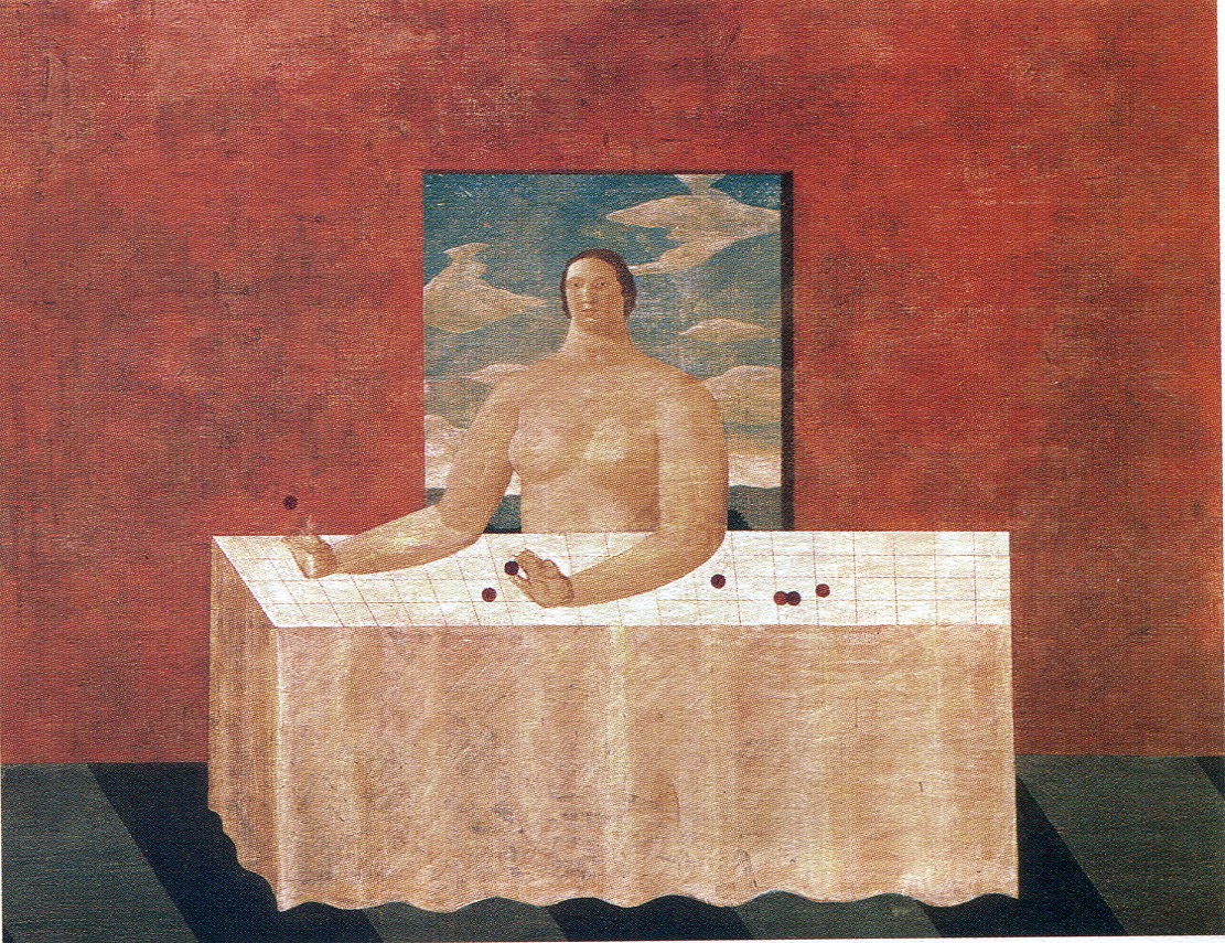
opinion what is drawn. To be sure, I can explain that a person is drawn on
an actual picture and the table is drawn. Therefore, I think that I cannot
say that nothing is drawn. However, I cannot guess that the picture
constituted on the person or the table means as a whole. This may be an
insufficient reason of my imaginative
power.
I do not want you for me to have
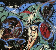
misunderstanding here. I do not regard this as bad. As pictures by which
directivity is completely different, the pictures of Jackson
Pollockin abstract expressionism have abandoned saying that something
is drawn. Those who see should just feel something for the picture, seeing
the done pictures. I think that Arimoto's picture is eventually a thing
near such a picture. However, Arimoto's picture is not an abstract
painting like Jackson Pollock but a representational painting. I think
that it is intentional that Arimoto drew the representational painting and
he expected the effect by concreteness by that. I have described that
minutely in explanation of other works. So to speak, I regard his picture
as the pile of an effect. It thinks that it is a reason for Arimoto's
picture to be called "musical." Music does not have a meaning fundamentally. In language, the language "dog" has pointed out the actual dog. It is meaning with fundamental it. However, music does not have the function to point out a specific thing. Even if there is music which describes a sight, it is not an entire copy but only a thing for which it expects to imagine that seemingly the person who hears it is it. Music expresses a feeling but the music cannot distinguish feelings like the "anger" in language. It is the state of the music which it simplified that those who make music, and those who enjoy music imagine each other from phenomena, such as relation and repeat of sound, and an overlap, freely to each. As Mozart has stated by the letter for those who make music repeatedly, music is the pile of an effect. Probably, the charm of Toshio Arimoto's picture resembles musical it. |
 There are
some which were stylized quite extremely and designed in the pictures of
Piero Dela Francesca or medieval times. However, in these pictures, it is
always designed on the premise of the scene of the Bible or the tale of
faith. Therefore, those who look at the pictures designed extremely can
understand generally what the pictures express.However, Toshio Arimoto's
pictures do not have a tale which will be the requisite which medieval
pictures had. Therefore, those who look at Arimoto's pictures cannot find
out the tale of being common there. A shallow critic will comment that
such Arimoto's pictures are the symbols of the post-modern society which
lost the big tale. I do not think that Toshio Arimoto had such perception
of the times. Although he was not conscious, such a time had reflected him
in the pictures which he draws. By Paige who expressed the comment over a
"Rondo", I stated the following. Present-day people came to feel a burden
to a modern individualistic person's way of life. They asked for lightness
compared with modern people. It was the medieval way of life which they
observed then. However, since they had lost the absolute existence of God,
they misunderstood the medieval way of life with the light way of life
without the pressure to an individual. Probably people who had such a view
are pleased with it, and will receive Arimoto's picture. Also to "Day of
Falling Petals", people are glad similarly and will accept. Those who look
at "Day of Falling Petals" do not understand a background for what is
drawn, and cannot understand what the person is going to do. It is not
that this picture has thrust the question before those who look at it, and
it means that this picture does not have a strong
opinion.